Tuesday, 13 October 2015

Practical - Applying a base

Brushes needed:
Foundation Brush
Duo Fibre Brush
Rounded Brushes
Kabuki Brush
Triangle Powder Puff

Products needed:
Illamasqua Matte Primer
Dermacolour Camouflage mini palette
Kryolan Ultra foundation 8 palette
Illamasqua Loose Powder in white

Foundation:
  • Clip the model's hair back and place a cape over them.
  • Use a spatula and scrape some product from the foundation palette depending on which colour you are going to use, if you need to mix products use different spatulas to take from each one and mix together on the back of your clean, washed hands.
  • Take a foundation brush and pick up some of the product and test it on the side of the face in a downward stripe to see if that is the right colour for the person's skintone. If the colour is not correct, just keep adding either lighter or darker shades until the colour is correct. Once you have the right colour, wipe off the test strips with a makeup wipe.
  • When applying the foundation, start on the nose and work your way out. You can mix the foundation with the primer to help it blend more easily on the skin rather than applying it to the face before hand. Make sure you cover the ears, hands, arms, neck and feet when working on camera as otherwise these areas will look a completely different colour to the model's face.
  • If the model has a spot, you can take a small bit of product on a cotton bud and apply this to the spot directly by dabbing gently on it. (This also applies if a model has any fresh piercings that cannot be removed, just go around them with a small cotton bud.)
Concealer:
  • The next stage is to pick your concealer shade for your model, the key is to go no lighter than 1-2 shades of your model's skin tone colour.
  • Once you have your perfect concealer shade picked out, take the product on a small rounded brush and apply to the inner corner of the eyes, under the eyes, on the outside of the eye and round the side of the eyebrow/forehead. Note: if your model has a lot of redness around their nose, you can also apply some concealer here too.
  • Next, take your kabuki brush and start to blend the concealer out. As this concealer is grease-based, it will streak so buffing is a very important stage for base application. To blend, just buff the product round the skin in circular motions until it starts to build up a more fuller coverage on the face and makes the face look warmer.
Powder:
  • Take your white powder and tip some into the lid of the container. Take your triangle puff and tap gently on to lid to pick up some product on the puff.
  • Apply this around the areas of the face that are likely to look greasy throughout the day and will need setting such as under the eyes, eyelids, around the nose, forehead and chin.
  • When applying the powder to the face, dab it onto the skin rather than dragging it as this may affect the look of the foundation and cause it to streak or smudge.
  • To get rid of any unwanted powder on the face, take a duo fibre brush and lightly sweep the powder off.
Different concealer shades:
  • Green is used for getting rid of any redness on the face and also for covering any blemishes.
  • Yellow is used to lift the skin and to give it more of a glow (good for under the eyes).
  • Purple is used to make the skin look more alive (good for people who have a grey tint to their skin).
  • Red is used to get rid of any dark circles or tones on the face.

I worked with Annabel for this practical. She had very pale skin so I took the two lightest shades in my foundation palette and mixed them together, this created the perfect shade for her skin.

(the two foundation shades that I used on Annabel)


As for the concealer, I used a slightly yellow toned colour for her skin as I thought she already had really good skin but I just wanted to make her eyes stand out a little more. She also had a little redness around her nose, so I applied a little more concealer around this area to cover that up. She also had some new piercings in her ears so I couldn't apply any foundation to these areas. 


(the concealer shade that I used on Annabel)


I personally found the foundation quite hard to work with, I am used to working with liquid foundations so it was a bit of a change for me to work with creams instead but I managed it well. I found that I had to use a lot of product to cover the face, even when I added some primer to the foundation I still thought it was quite hard to apply and blend out. I didn't really like the idea of using a kabuki brush to buff the foundation into the skin either but I found it really useful to try this technique out. 


Once I had finished Annabel's face, I thought the foundation looked really nice on her, she had a nice highlighted glow, especially around the eyebrows and on the cheekbones and I had powdered down some parts of her face so they looked nice and matted. Overall I am happy with the outcome of my first base application and I am excited to carry on trying new products and working with different types of products.

Face Charts - Practise

Before applying makeup on any client/model, it is always best to plan out your design on a face chart as this shows an accurate representation of what your model's face will look like after you have finished the makeup. It always helps for when you are working on a client to plan out a face chart look so you can show them what the finished outcome will look like and if they or yourself want to change anything about it. In the makeup industry, especially for fashion makeup artists working on catwalks and runways around the world, quite often this can be all fast paced and there is very limited time to come up with and create a new design idea within the time you are given so to come prepared with either one or sometimes several different looks will come in very useful.

After spending some time with the class looking at colour theory and learning about all the possible colour combinations to create and what works well on the face, we were given a face chart and were told to just come up with any idea we wanted.

I had mixed feelings about this as I had never created a face chart before so I was feeling slightly nervous but I felt a little better after I researched some designs and looked at some different face charts and started to think of some ideas in my head.

I didn't know too much about where my face chart was heading, but I just got my makeup and brushes out and started practising. I used my makeup brushes, MAC warm neutral eyeshadow palette and Kryolan glamour glow essence palette.


I started with the eyebrows so this could give the definition to the face and I used a light brown eyeshadow and an angled brush and gave an arched shape with faded hairs at the front to create the look and effect of an actual eyebrow. Next, I moved on to the eyes and I used a black fine liner to draw a flicked eyeliner wing and then a light brown eyeshadow on the eyelid and then using a small, thin brush dipped in a darker brown eyeshadow, I created a cut crease look. I used a small brush again and put black eyeshadow on the bottom, lower eyelid and then again using the fine liner, I drew small thin lines at the tops and bottoms of the eyelids to give the effect of real eyelashes. Just to give it a bit more detail, I added a blue eyeshadow on to the eye pupil to make it look more realistic.

For the face, I used a larger brush and dipped it into a medium brown shade and brushed down the cheekbones to give a contour look to the face. I took a normal drawing pencil and drew the shape and shadow of a nose and then went around this in a brown eyeshadow. I took a lighter brown colour and sweeped it across the face just so the paper didn't look too white compared to the rest of the face. The last step was the lips, I took the fine liner and drew around the lips and also drew some thicker lines on the inside to give the effect of a 'pouted lip'. I then took a medium pink colour and added this.

I am quite happy with how this face chart turned out, considering this is the first one I have ever done and also because we used paper instead of real face charts, so it was harder to blend. I am very excited to keep practising and creating more designs and becoming better at blending on them.


Monday, 12 October 2015

Colour Theory

Colour Theory in makeup is when you have light, which is essentially colour, and you mix a variety of shades to create a colour combination. Sir Isaac Newton created the very first colour wheel in 1666. 


You start off with a colour wheel which contains primary, secondary and tertiary colours.


Primary colours - the primary (basic) colours are red, blue and yellow (these are pure colours)

Secondary colours - the secondary colours are purple, green and orange (these are a created by mixing a variety of primary colours)

Tertiary colours - the tertiary colours are red-orange, yellow-orange, yellow-green, blue-green, blue-violet and red-violet (these are created by mixing a variety of primary and secondary colours) t

Colour Theory is made up of three combinations;
Lightness (light vs dark and black vs white)
Saturation (intense vs dull)
Hue

Lightness
The brightness/lightness of a colour can be achieved by adding black or white to a certain colour. For example, if you wanted a lighter shade of blue, you can add white to achieve this or for a darker shade, you can add black.

Saturation
The saturation is the intensity of the colour, a fully saturated purple is bright and intense whereas a lilac shade is more dull and would be de-saturated.

Hue
Hue is a basic colour (primary), there are infinite colour combinations you can make. Primary colours do not contain any black or white in them. To get different shades of colours, you can add shades, tints or tones to these primary colours.

Shade is when you add black or white to a primary colour

Tints are when you add white to a primary colour, and

Tones are when you add grey to a primary colour


Complimentary Colours
These colours are opposite each other on the colour wheel. When combined, they create a very strong contrasting shade that 'pops'.


In makeup, if you were trying to make someone's features stand out, you would use the opposite colour to achieve this. For example, if someone had blue eyes, to emphasise them, you would use an orange eyeshadow or for green eyes, you would use a purple eyeshadow as these are the opposite to each other in the colour wheel.

Contrasting Colours
These colours are next to each other on the colour wheel. 


Analogous Colours
These colours are created by combining colours next to each other in the colour wheel.


This effect blends the most together as the colours are so similar so this is probably the most favoured style of colour theory used in makeup

Achromatic Colours
This style is created by using just black, white and all shades of grey.


Neutrals
These are all colours such as browns, beiges and shades of creams.


Chromatic
These are colours that have hue in them and don't contain any white, black or grey. Blue and green are examples of this.


Monochromatic
This is shades of the same colour, for example a light lilac would be at one end of the spectrum and a dark purple would be at the opposite end.


Warm and Cool Colours


In a colour wheel, you can split it in half to determine which is a cool or a warm colour. All the colours on the left are warm and the ones on the right are cold.


This is the warm colour spectrum, these colours tend to be very bright and eye popping. These colours include red, orange, yellow and shades of around these types. In makeup, reds can be both cool and warm. If the red has a blue undertone, it is cool and if it has an orange undertone then it is warm.


This is the cool colour spectrum, these colours have a more calmer and softer look. These colours include blue, green and purple. In makeup, if a green has a more yellow undertone then it is warm and if it has a more blue undertone then it is cool.

Even though you can have colours that are very similar, they can turn out to have different undertones which give them a slightly different look when applied. As Henry Ford once said 'any colour as long as it's black.'

For example, MAC Ruby Woo, Lady Danger and Russian Red are all similar red lipsticks but they all have a different undertone.


Ruby Woo is a cool undertone, you can tell this because it has a blue tint to it.
Lady Danger is the opposite as this is a warm undertone and has a more orange tint to it.
Russian Red is just a neutral red, it doesn't really have an orange or blue tint to it.

Colour Context
Colour Context is how colour looks when linked with or surrounded by other colours and shapes. For example, this red square changed when surrounded by different colours in a larger square.


Red looks a lot more bolder when placed against a black background and doesn't stand out as much against a white background. When placed against a bold, orange colour, the red square looks dull and you can't see the square that much as the colours are fairly similar. Against the blue background, the square shines and you are automatically drawn to it. Out of all four, the red square looks the largest when placed against the black background.

White Face Makeup experiment

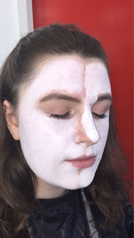
In class, we tried out different ways to create a white face using the foundations we were given in our kit.

We had Illamasqua Skin base in 01, Kryolan Aqua Colour and Kryolan Supra Colour. We worked in a group of 3, we used Illamasqua on one girl and did a half and half face comparison of the two Kryolan foundations. This is what I thought..

Illamasqua Skin Base in 01:
I thought that this foundation was really easy to apply, it didn't go on dry or streaky and it was good to blend to the skin. We applied it with a Zoeva rose gold brush which was like a rounded buffing brush. We didn't use a primer on the skin before hand so the skin looked a little dry. The bad thing about this product was that it doesn't build up, the colour stays the same and only the coverage built up.


Kryolan Aqua Colour:
Out of all three foundations, this was the worst one I found. When applying it, it went on really streaky and when you tried to apply more product over it, it went patchy. I found that this foundation was more for applying small detail to the face rather than for the whole face as a base. This product was very white and it looked almost like a face paint.


Kryolan Supra Colour:
This product was quite easy to apply, I thought it was easy to build up the layers on the face as well. The good thing about it was that it doesn't go patchy on the face unlike the aqua colour, it only goes patchy if you buff it into the skin but I don't like doing that technique anyway. This shade of foundation isn't too face paint like and it isn't too light either.


(Aqua colour on right and Supra colour on left)


Out of all the foundations, I think my favourite one to use for Elizabethan face makeup is the Kryolan Supra Colour as the Illamasqua Skin Base is too light looking on the face and doesn't have a full coverage look to it and the Kryolan Aqua Colour was too face paint like on the face and too bright but the Supra Colour was the perfect colour for an Elizabethan style. This product was also the easiest of all the three to build up layers and was the least likely to go patchy. To achieve a full coverage look, you can use a flat foundation brush to paint it on the skin. 

Saturday, 3 October 2015

Introduction to First Project

New Elizabethans

Our very first project brief is called New Elizabethans and we have to do research on the Elizabethan time period. We were told not to just focus on Queen Elizabeth herself and we should also include things such as film clips, music from that era, paintings and also portraiture all linking to this period.

I am going to do a lot of research, not only on Queen Elizabeth but also on the whole era as well. I am really excited to work on this project as I think the Elizabethan period is so fascinating and it was such a key period as it marked the Renaissance in Britain and developed so much art including poetry, paintings, fashion, music and literature. It was known by historians as 'The Golden Age'. We could say we have a link to this time period as our generation now is such a key period in history. The Renaissance and arts changed the Elizabethan Era just like technology has changed our era today.

I don't have a lot of knowledge into this era and Queen Elizabeth but I am very excited to learn and research more and I am going to find out when any exhibitions and shows are on that I can go and visit. I am quite nervous to do the makeup practical side to the project as it will be a completely new experience for me but I am really going to push myself to the limit and work my hardest and be as creative and imaginative as I can be. I am looking forward to working with lots of different new sources  such as wigs and designing my own hair pieces and also creating pieces to go on the face such as accessories and also creating and designing my look as the more practice I have in designing face charts and doing practical work, the better I will become.


Research: Elizabethan Time Period Makeup

During the reign of Queen Elizabeth, the look for women changed history. Before her reign, it was considered 'vulgar' to wear make up and use perfume and this was disapproved of by upper classes. Many woman had a 'seductive look' around this time period but Elizabeth stuck to her image as a 'virgin queen'.

Her look was based around this idea of 'pure beauty'. She had light red hair and a pale, snow-like complexion with rosy red tinted cheeks and rouge red lips.

This look was only for the upper class women during this time period as lower class women would spend their day working outside and would often end up with a suntan. Because of this, you could always tell the wealthy women to the poor, a pale woman of this era was a sign of power and wealth.

As well as wealthy, upper class women, this pale complexion also applied to the men too so you could tell if they were upper class or not. This look was achieved with white face make up.

In many of Queen Elizabeth's portraits, you could see her white face make up.

Another reason for the upper class women to wear this pale make up on their faces was to help hide the look of ageing. The rich looked all fresh faced and wrinkle-less and the lower class women would look the complete opposite.

To make the popular white face make up, the upper class would use a product called Ceruse which was a mix of vinegar and white lead. This was a poisonous product and would often make the women's faces bleed but it was such a craved and desired look that the woman didn't care and would continue to wear the make up anyway. Another form of make up that they used was face paints that was created from plant roots and leaves. As for their skin, because of the poison in the vinegar and lead, their skin would end up covered in blemishes, wrinkles, spots and even freckles, so to hide this they would use rosewater, lemon juice or sometimes even a mix of eggshells, alum, mercury and honey to get rid of this.

Many upper class women during this era would have quite light hair and Elizabeth's was a light red, almost ginger colour. Many women, to achieve a light hair colour would dye their hair a yellow shade by creating their own hair dye consisting of saffron, cumin seeds, celandine and oil. Although many people dyed their hair, quite often the Queen would wear a wig or hair piece. She is said to have had over eighty wigs and hair pieces during her time.

To achieve the rosy red cheeks and the rouge red lips that was ever so popular during this era, they would use a dye called Cochineal which comes from a scale insect (bug) and is extracted from it's body and eggs. To give the effect of fuller, darker eyelashes, Kohl was used as a mascara like substance.

Sources:
www.elizabeth-era.org.uk
'Elizabeth Make-up'

www.beautifulwithbrains.com
'Beauty History: The Elizabethan Era'


Friday, 2 October 2015

Practical: Skin care and Cleansing the skin

Thursday 1st October

In our lesson today, we learned how to properly cleanse, tone and moisturise the face. As a makeup artist, it is very important to make sure that the person's face you are working on is clean and fresh before applying any product to it.

The first step you should always take is it ask your client if they are allergic to any products or if they have sensitive skin. If your model does have sensitive skin, you should make sure all your products you are using are suitable for that skin type. You should always find out what skin type they have first before applying any product (dry, normal, oily or combination.)

What products are needed
1. Cream cleanser
2. Toner
3. Moisturiser
4. Cotton buds
5. Cotton pads

The steps to properly clean the face
1. Apply a black gown around your model so no product falls on to their clothing
2. Clip back any hair away from their face
3. Make sure your hands are clean before working on the model
4. Take a small amount of cleanser onto two cotton pads and use an upward motion on the face starting from the neck and working your way up to the top of the forehead
5. Take new cotton pads, apply cleanser again and do the same motion on the cheeks and around the nose and mouth area
6. Apply a small amount of cleanser on to a cotton bud and wipe the eye and eyebrow area to get rid of any mascara or eyebrow product
7. If the face still looks like it may have some makeup on it, just take some more cotton pads and apply cleanser and repeat the steps until the face is completely clean
8. On a new cotton pad, place a small amount of toner and apply to the model's face and neck area, again working from the bottom upwards
9. After you have finished these steps, make sure your hands are clean and take a small amount of moisturiser, rubbing together in your hands, then apply all around the model's face
10. Remove clips from model's hair and remove gown

The products needed

After I cleansed the model's face

After toning the model's face

A fresh face after being moisturised, ready for makeup application